Mobile first + Mobile first indexing
Picture it: you are out running errands and your stomach starts to grumble. You are nowhere near a computer to search for close restaurants so you grab your phone to look for a place to eat. A nearby cafe catches your eye so you click on the link. You practically need binoculars to read the appetizers and half of the menu is cut off. The website has not been designed with a mobile first approach. Your initial experience with this cafe is frustration which leads you to just choose a new place with a website optimized for your smartphone.
Surely, you weren’t the only one to have that reaction; or the last. As of 2017, mobile devices were responsible for more than 52% of total global internet traffic according to communications company Ericsson. In 2020, that percentage is expected to climb to 70%. More and more people are using smartphones and tablets to access websites, and in that sort of climate, a well functioning mobile website is crucial to reach as many potential customers and clients as possible.
It's very likely by now that you have a responsive website, and hopefully one that works well on small screen sizes. But during the design and build process, were you focused on desktop first and then did you make accommodations so it would "work" on tablets and phones? The mobile first strategy in website development is to create a framework for the smallest screen first, then work up to tablet and desktop sizes. Essentially, it’s about delivering the best user experience to the correct device. This method has become widely used, and is almost mandatory to create the best possible experience for internet users.
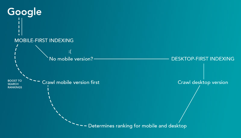
In case you didn't know, Google loves a good mobile site, I mean... really loves them! Google caught onto this trend and announced in March 2018 they will begin working towards using a mobile first indexing system. With the introduction of mobile-first indexing, instead of analyzing a company’s desktop site first, Google will prioritize mobile web pages to determine search engine rankings. This means the mobile version of a website will be used as the benchmark for indexing and determining the site ranking instead of the desktop version. The takeaway: you need to consider your sites mobile version the primary version.
Mobile-first indexing will reward good search rankings to only those websites which have made mobile optimization their priority. Which means if a website is not mobile optimized, its traffic will be affected. In absence of mobile websites, Google will still crawl desktop versions- however, overall site rankings will definitely take a hit. If a website does have a mobile version the content from the mobile site will be used in google indexing.
With the introduction of mobile first indexing, site owners can no longer avoid optimizing their website for smartphones and remain strong against their competition. This new method of indexing will reward good search rankings to only the websites that have made mobile optimization their priority.
If you are interested in mobile optimization or in a mobile first approach we are always here to help! Contact Us
Gregory started his career as a front-end developer in 2006 after studying as an apprentice printmaker in Northern California. With the help of his detailed design skills in art, photography, typography, and layout, he creates engaging websites for our clients.