Guide to ADA Compliant Websites
Ask any owner of a brick and mortar store about the ADA, and they can tell you all about what it means for them. They may tell you how they had to replace their stairs with a ramp, or how they’ve trained their employees to describe products to blind patrons. But if you ask the owner of a website what the ADA means for them, you may find that they believe that it doesn’t have anything to do with them. They’re wrong.

Image from Pixabay
The Americans with Disabilities Act (ADA) became law in 1990. Title III of the ADA prohibits discrimination against disabilities in all areas of public life, including digital spaces like websites. The ADA has been in headlines recently because private sector companies have been facing lawsuits from people with disabilities who couldn’t use their sites because the site’s content was inaccessible. One of the biggest recent cases was Juan Carlos Gil v. Winn-Dixie (a grocery chain in the Southern US). The plaintiff, Juan Carlos Gil has vision impairment and uses screen-reader software to browse the web. Gil couldn’t navigate to 90% of the links on the site, preventing him from accessing digital coupons, finding store locations and refilling his prescriptions online. The judge decided the case in favor of Gil, stating:
“Winn-Dixie has violated the ADA because the inaccessibility of its website has denied Gil the full and equal enjoyment of the goods, services, facilities, privileges, advantages or accommodations that Winn-Dixie offers to its sighted customers.”
What Is an Accessible Website?
An accessible website makes sure that content is available through multiple sensory channels (such as sound and sight) and they allow for additional ways to navigate a site beyond just point and click. For example, a deaf user may be able to watch a video on your site, but they’ll need to have a transcription of the video in order to fully access the content of the video. Another example might be a visually impaired user filling out a form; they’ll use screen reading software to tab from one field to the next and the screen reader software will read out the labels that the web developer assigned to those fields. Too often, developers won’t provide any labels on form fields at all, thus preventing a blind user from being able to know what each field is for, which obviously makes the form inaccessible to them.
How Can I Make My Site Accessible?
Well, just follow the 38 criteria put forth in the WCAG 2.0 (Web Content Accessibility Guidelines) for the AA compliance level! Don’t worry, it’s not as daunting as it seems. Your website is probably already passing most of them. To better understand where those criteria come from, it’s best to start with the four guiding principles:
Perceivable
Information and user interface components must be presentable to users in ways they can perceive.
- Guideline 1.1: Provide text alternatives for any non-text content so that it can be changed into other forms people need, such as large print, braille, speech, symbols or simpler language.
- Guideline 1.2: Time-based media: Provide alternatives for time-based media.
- Guideline 1.3: Create content that can be presented in different ways (for example, simpler layout) without losing information or structure.
- Guideline 1.4: Make it easier for users to see and hear content including separating foreground from background.
Operable
User interface components and navigation must be operable.
- Guideline 2.1: Make all functionality available from a keyboard.
- Guideline 2.2: Provide users enough time to read and use content.
- Guideline 2.3: Do not design content in a way that is known to cause seizures.
- Guideline 2.4: Provide ways to help users navigate, find content, and determine where they are.
Understandable
Information and the operation of user interface must be understandable.
- Guideline 3.1: Make text content readable and understandable.
- Guideline 3.2: Make web pages appear and operate in predictable ways.
- Guideline 3.3: Help users avoid and correct mistakes.
Robust
Content must be robust enough that it can be interpreted reliably by a wide variety of user agents, including assistive technologies.
- Guideline 4.1.: Maximize compatibility with current and future user agents, including assistive technologies.
To recap: there are four principles, which govern the 12 guidelines, which in turn govern the 38 success criteria at the WCAG AA compliance level.
Implementing the Guidelines on a Website
Now that we’ve established where the 38 success criteria come from, let’s take a look at some real-world examples of what it would look like to pass and fail a criterion. Let’s start with the first criterion:
- 1.1.1 Non-text Content: All non-text content that is presented to the user has a text alternative that serves the equivalent purpose.
Let's look at two apparently identical images:


Image by Vojtech Okenka via Pexels
To a person without visual impairment, these two images appear the same. However, ‘behind the scenes’ the image on the left has no ‘alt tag’, which is an attribute that HTML images should have. Simply put, alt tags describe images. The alt tag for the image on the right is “Cupcake with two layers of frosting and a raspberry on top”. The alt tag is important because a person with visual impairment will likely be using a screen reader to browse your website. The screen reading software will read the website, and when it encounters the cupcake image, it will look for the alt tag then "read" that description to the user. Easy right? All you have to do to pass this criterion is provide a description for the images you have on your site.
The following code snippets are the HTML for each of the images. Notice the alt tag on the second image element:
<img src="/images/cupcake.jpg"><img src="/images/cupcake.jpg" alt="Cupcake with two layers of frosting and a raspberry on top" >
Text Contrasts
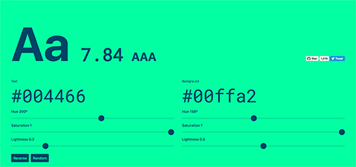
The next guideline I'd like to discuss is 1.4: Make it easier for users to see and hear content including separating foreground from background. One of the criteria which must be met in order to comply with this guideline is 1.4.3 Contrast (Minimum): The visual presentation of text and images of text has a contrast ratio of at least 4.5:1 (with some exceptions). What this means is that the difference between the background color (or colors if using an image or a gradient) and the text in front of that color must be at least 4.5:1. For a great visualization of what a 4.5:1 ratio looks like, check out Brent Jackson's tool Colorable.
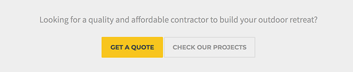
Text contrast is often an issue keeping websites from achieving WCAG AA compliance - especially with the recent popularity of grey as both a text and background color. In the screenshot below, there is a Call to Action line of text and two links: "Get a Quote" and "Check Our Projects". The text for both the CTA and the link on the right side have a contrast of 2.46:1, which is far too low. But the link on the left has a great contrast ratio of 5.92:1:
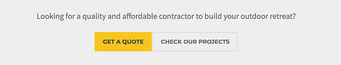
To resolve this issue, we could either change the background color or the text color. Let's assume we have a client who loves that light grey background color and doesn't want to change it. So we'll enter the colors into Colorable, then change the hue, saturation and lightness settings until I achieve a ratio of at least 4.5:1. After doing that, I've got my new text color, giving me a ratio of 4.53:1. Notice that the CTA text and the ink on the right are now darker and easier to read:
Accessible Functionality in Websites
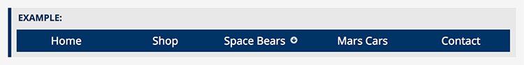
The ADA governs sites beyond the content as well; an accessible website provides alternatives for the functionality of the site. One of the best examples of this is the hover effect that you so often see in menus. Websites often rely exclusively on the mouse hover to display sub-items in a menu, but using hover in this manner makes the site inaccessible because users with a motor control disability who have difficulties with using mice won’t be able to use their keyboard to see those sub-items. One way to accommodate those users is to add a button, often with a downward pointing arrow, to that “parent link” (the link that users would hover over to activate the sub-item links) that keyboard users can navigate to, hit enter, and see those sub-items. In the example below, the parent link "Space Bears" has a button within it that can be activated by a keyboard, showing the dropdown menu.
What Now
Beyond the fear of a lawsuit, there are other reasons for making sure your site complies with the WCAG 2.0 AA criteria. In my view, there are two big ones:
- It’s the right thing to do.
- You’ll reach a bigger audience; Your business will make more money or your non-profit can better achieve its goals.
Oh, by the way, we'd love to help you bring your website into ADA compliance. Fill out the contact form below and we can get started! For more information, don't forget to check out our 10 Tips for Designing an ADA Compliant Website or our rundown of ADA Compliance Tools for Your Site.
Kyle has more than five years of management and teaching experience. In addition to being the resident grammarian, he styles and builds features for new projects in addition to completing client requests for style and content updates.