Google Analytics Reports Explained with Screenshots: 7 Helpful Uses

Image from Pixabay
Sure, Google Analytics provides a multitude of reports that help business owners, non-profit executives, and brand marketers alike interpret website performance…but it’s A LOT of information to deal with.
It can feel like a blitzkrieg of metrics and data, especially if you’re a beginner to Google Analytics.
One must even study all the nitty-gritty ins and outs before taking the Google Analytics IQ exam to become qualified as a GA expert—but I’m here to save you time and make web analytics reporting easier for you and your business, with the handy help of some visual screenshots along the way!
Want the important stuff without the pain?
Follow my thorough walk-through and you’ll see what you might have been missing from your web analytics.
Let’s break down these 7 important reports into 3 categories: Audience, Acquisition, and Behavior.
Audience Reports
7) Web Traffic Fluctuations + Time Period Comparisons
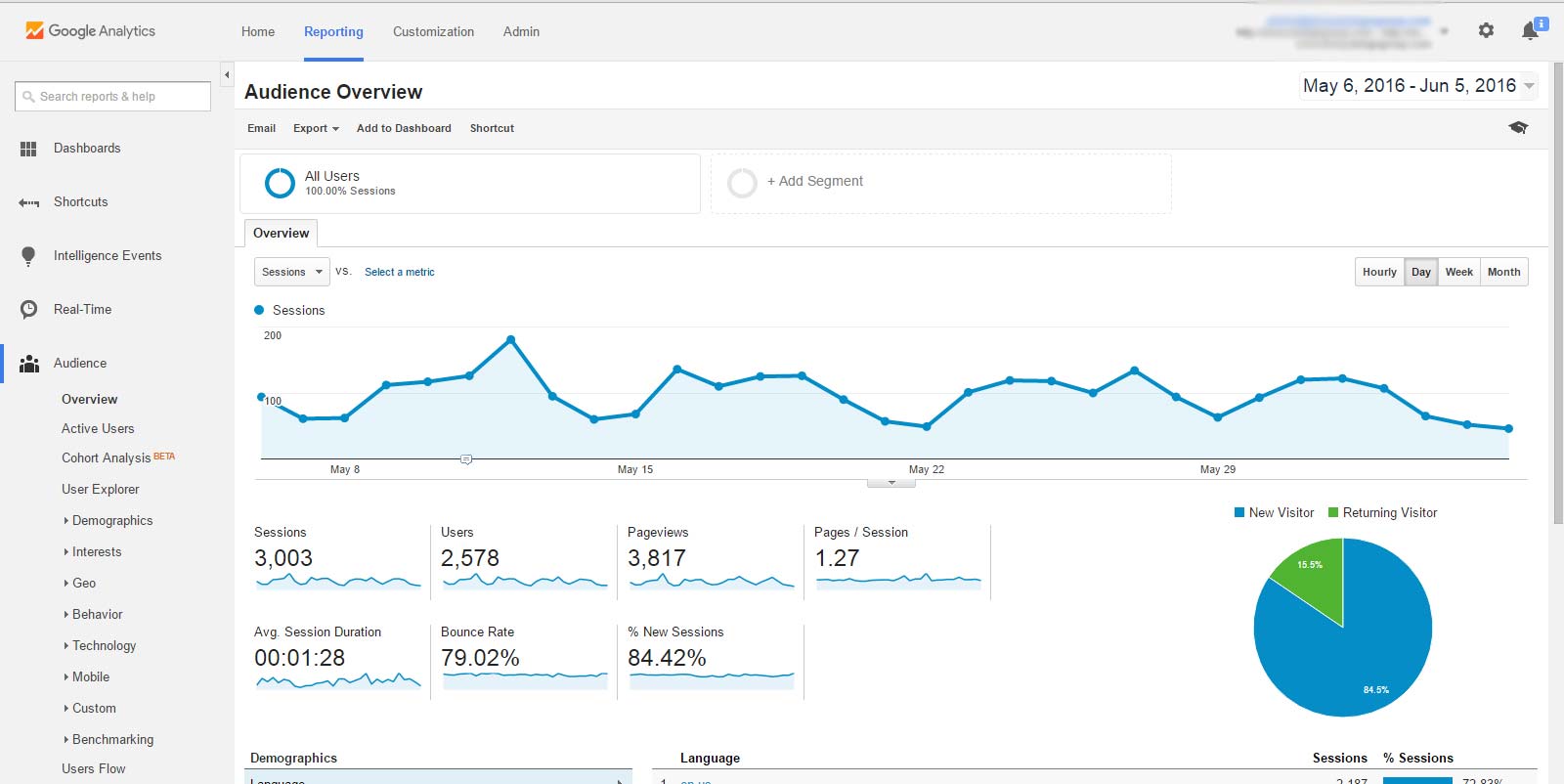
Alright, so you’ve opened up Google Analytics and now you’re brought to the Audience overview by default.
Here’s how it looks like on this example website whose name I’ll keep secret…
(click here to open above image screenshot in new window)
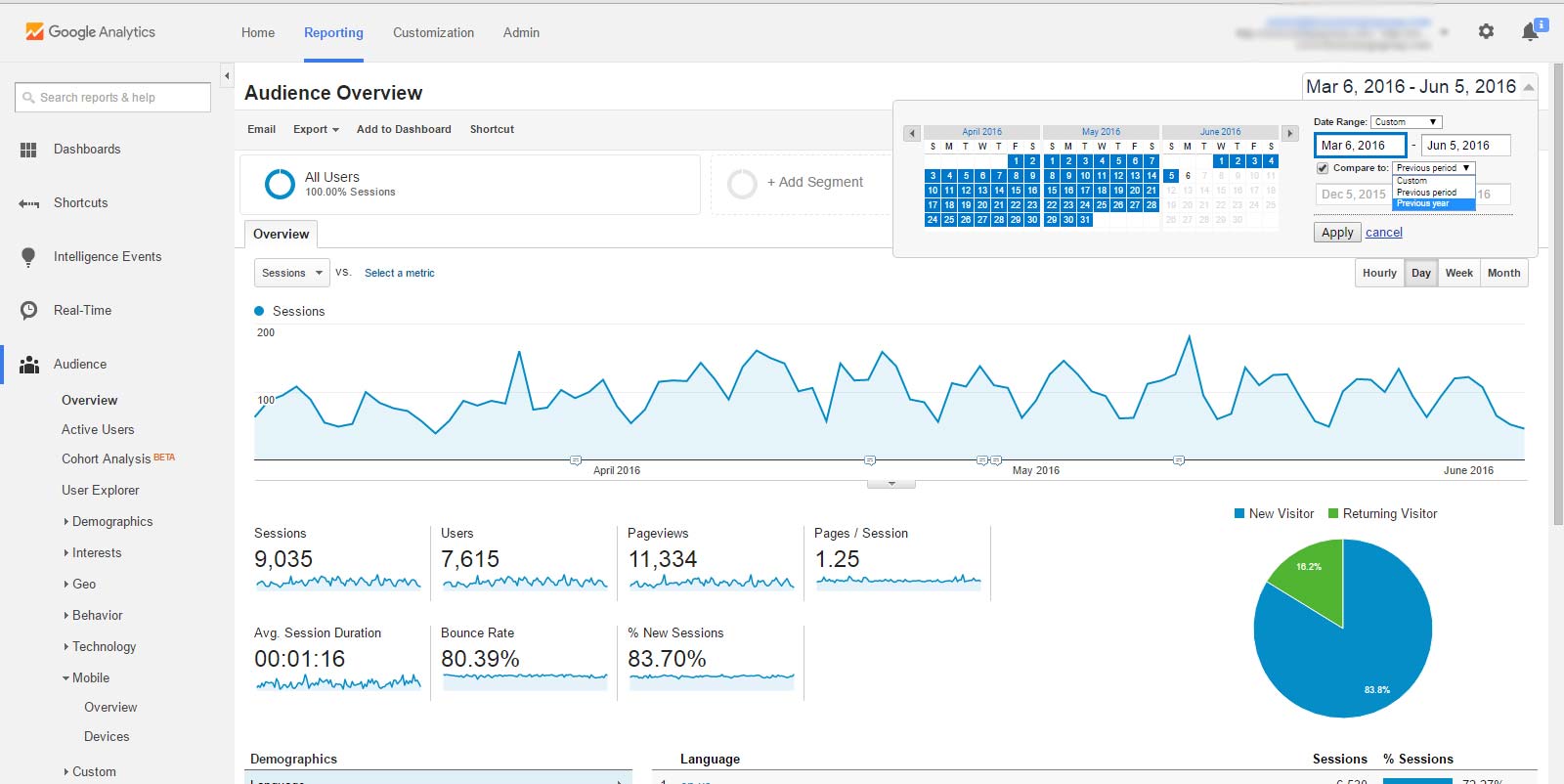
If you already know how to select different date/time periods to compare web traffic fluctuations against each other, just skip over to the next section.
If you aren’t sure how to, check out the screenshot below to see that the top-right drop-down box gives you a calendar view:
(click here to open above image screenshot in new window)
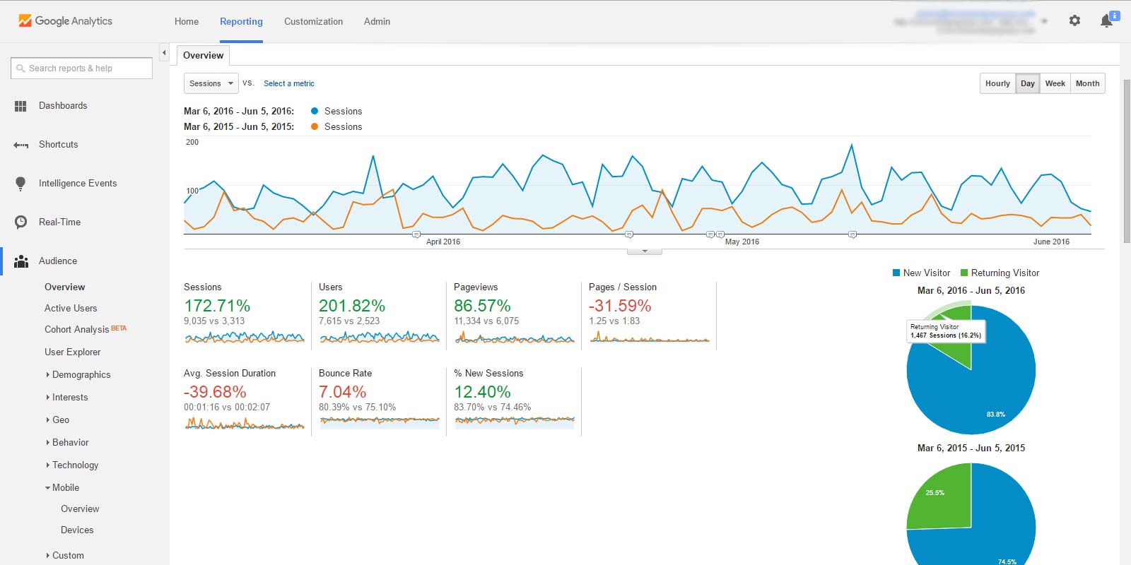
Upon clicking "Apply," you get this screen:
(click here to open above image screenshot in new window)
After setting a secondary time period (the orange line) to compare against the primary period (the blue line), it’ll modify all the information across other reports to include the % changes for each metric, such as the percent change in sessions, average session duration, pages per session, and bounce rate.
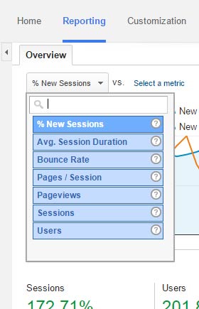
While the visual graph maps out the % of new user sessions by default, you can change this metric by clicking the drop-down box at the top-left (you can also select a second metric to graph for comparison):
(click here to open above image screenshot in new window)
Reviewing different time & date periods as well as comparing your web traffic fluctuations is great for many reasons, including:
• Understanding the average peak points for web traffic, including the time of day, day(s) of the week, month(s) of the year, etc.
• Comparing % of new sessions and average session duration against previous time periods to measure performance improvement or loss.
• Measuring effectiveness of marketing campaigns/tactics such as major SEO changes, PPC ads, PR releases, or other forms of advertising.
• Learning how many of your users are new visitors vs. returning visitors.
6) Multi-Device and Browser Performance QA
QA, or quality assurance, in the context of your website entails ensuring it works everywhere in every combination.
That means your site loads up fine on different types of mobile, tablet, and desktop computers on different sets of browsers. With the rise of the mobile, performing careful multi-platform QA is essential.
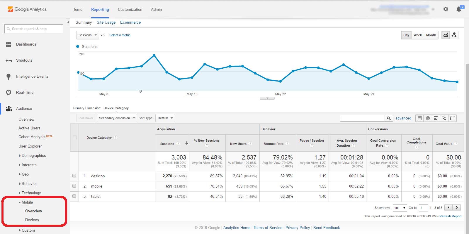
To do this in Google Analytics, simply click “Mobile” and then “Overview” from the side-bar on the left—see screenshot image:
(click here to open above image screenshot in new window)
Immediately, you’ll see your web traffic data for desktop, tablet, and mobile, including the separate bounce rates and session durations for each device category.
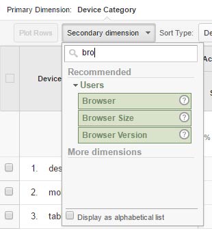
To get these 3 categories to be split up further into the web browsers for each device type, click the “Secondary dimension” drop-down box, then type in “browser” until you see that “Browser” option appear—see screenshot:
(click here to open above image screenshot in new window)
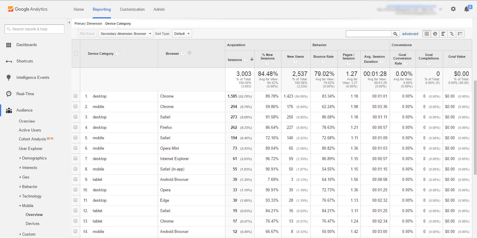
After clicking “Browser,” you’ll now have all of your device type + browser type combos, sorted from highest session amount to smallest. It’s a very handy report to check out:
(click here to open above image screenshot in new window)
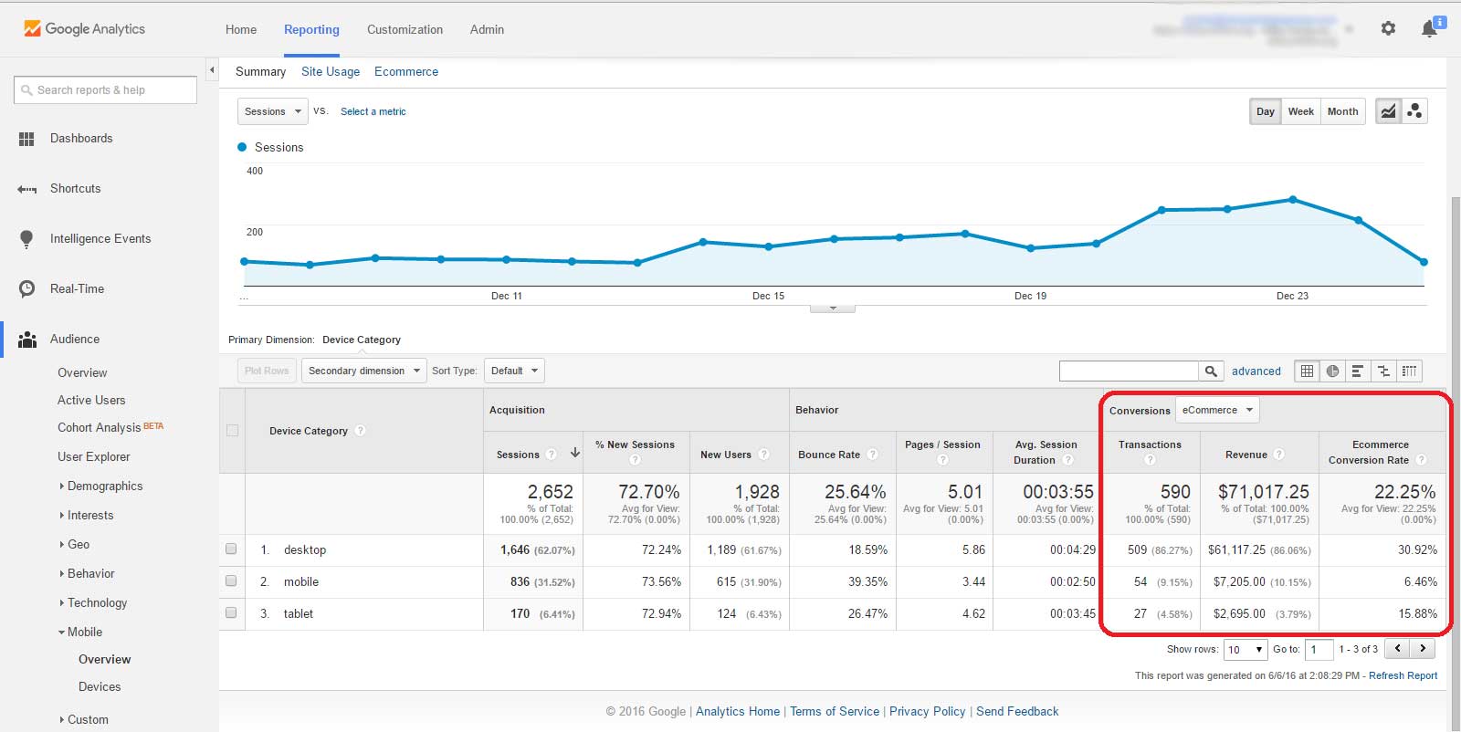
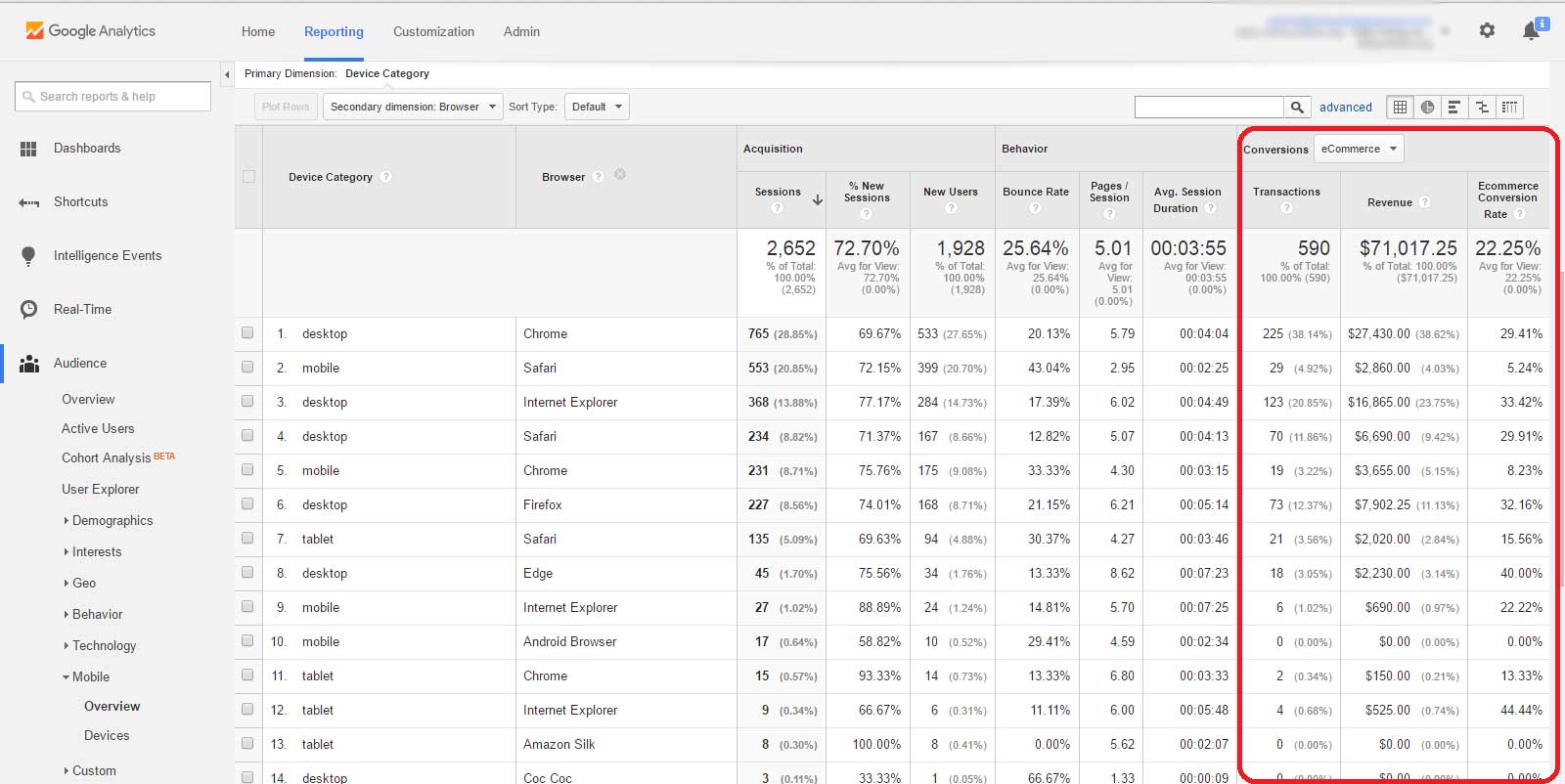
Do you run an e-commerce website? If you have your conversion tracking set up properly on your website, the conversions at a dollar amount will be visible for each device category, and when broken down further, browser category as well—see screenshots below:
(click here to open above image screenshot in new window)
(click here to open above image screenshot in new window)
Checking via Google Analytics to ensure you have the optimal user experience for each device and browser combination will maximize your business conversions all across the board.
Quality assurance on your e-commerce website’s online store will ensure your business is profiting, instead of losing potential sales.
Don’t let your visitors bounce out due to a crappy mobile experience!
► Website not looking or working right?
► Tell us about it.
Acquisition Reports
5) Web Traffic Acquisition Sources
Where is your web traffic coming from?
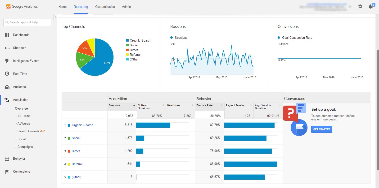
You want your search rank on Google, Bing, and Yahoo to go up but how many of your users come from organic search? How many from social media or website referrals? How about direct traffic?
By clicking “Acquisition” and then “Overview,” you get a nice pie chart and bar graph detailing all of this information for the time period you already have selected—see screenshot image:
(click here to open above image screenshot in new window)
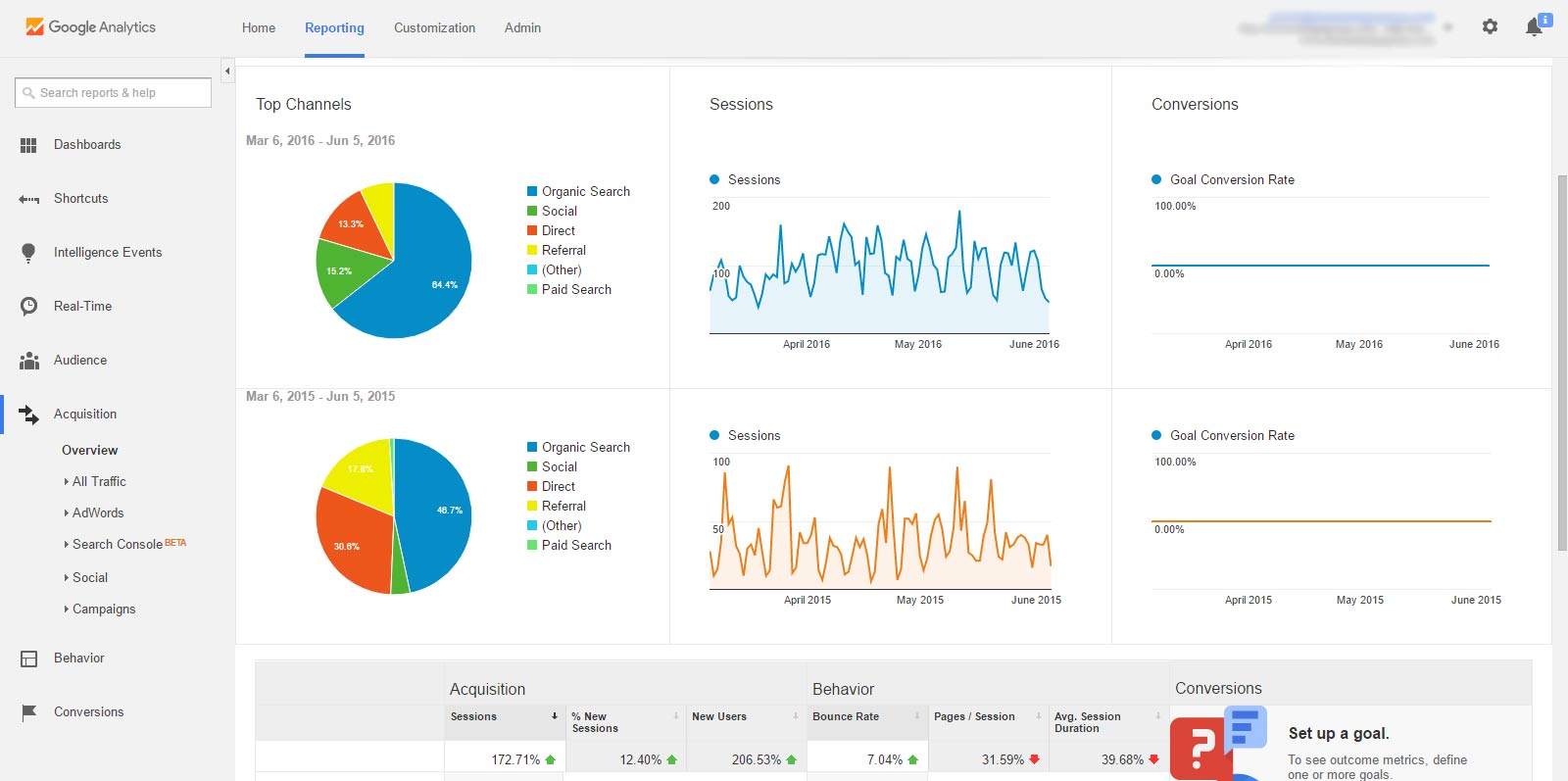
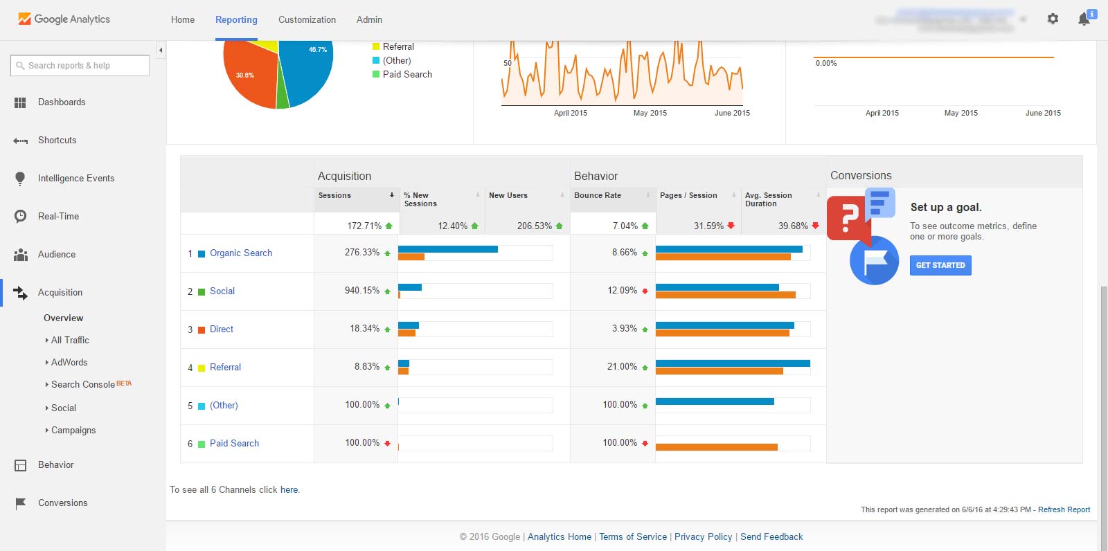
And of course if you have two separate time periods selected for comparison, you’ll get two separate pie charts, two sets of bar graphs, and the different metrics’ percentage increase/decrease information:
(click here to open above image screenshot in new window)
(click here to open above image screenshot in new window)
Clicking the segments from the pie chart(s) or bar graph(s) will detail the individual sources for that channel.
4) Top Sources & Mediums + Spam Detection
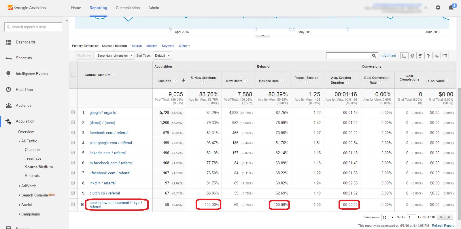
If you’d like to get a nice, simple overview of the leading mediums & sources that are driving traffic to your website, just click “All Traffic” from the left panel and then select “Source/Medium” underneath.
You should see a list of all Source/Medium combinations, sorted by the ones that drive the most user sessions. Again, when you have two time periods selected, it’ll give you a different screen with comparison data—see screenshots below:
(click here to open above image screenshot in new window)
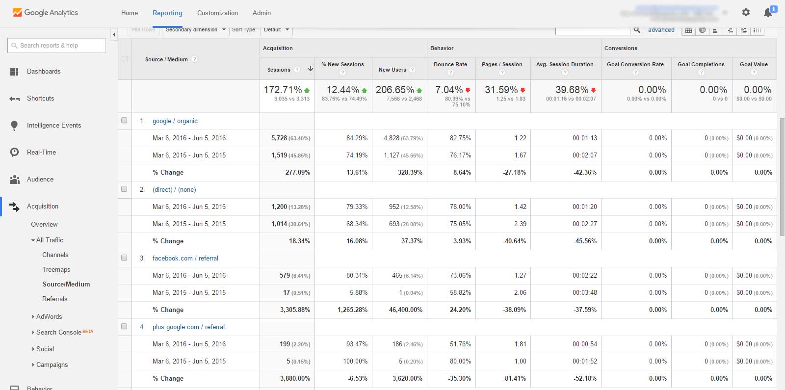
(click here to open above image screenshot in new window)
Now, looking at that first image, you’ll notice the very bottom Source/Medium combination, along with some of its accompanying metrics, is circled in red.
This “cookie-law-enforcement-ff.xyz / referral” is created by a referrer spam bot, to fish people like yourself into downloading/purchasing from their website…yes that’s right, spammy advertisements find their way into Google Analytics reports.
To locate other referral/referrer spam, click “Referrals” on the left-side bar and then scan for other sketchy-looking referral sites with unusual bounce rates and session durations. If you want to learn more about how to use Google Analytics to identify, block, and filter referrer spam and ghost spam, visit our past blog post.
Behavior Reports
3) User Behavior across Individual Webpages
This report is one of my favorites and is one that I use quite frequently.
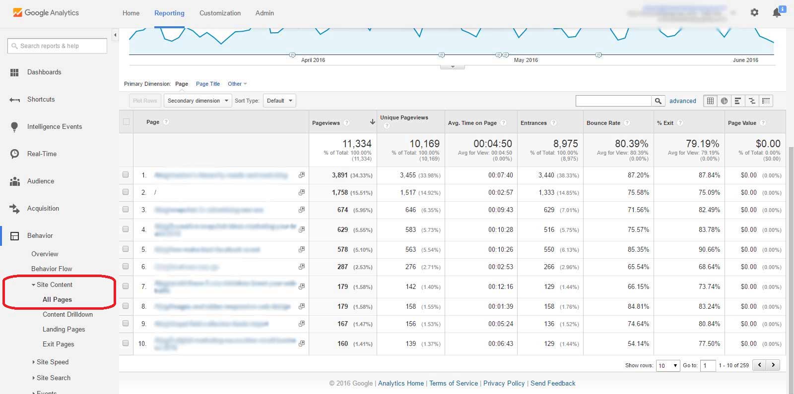
With a one date range pre-selected, click “Behavior,” then click “Site Content,” and then click “All Pages” underneath.
You’ll then see a list of your top 10 webpages sorted by most pageviews, including your homepage as marked by just a “/”. Each page’s row contains other useful data—see screenshot image:
(click here to open above image screenshot in new window)
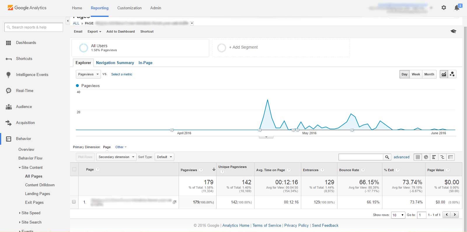
Alright, so let’s breakdown how people are getting to that specific webpage. We’ll use webpage “7.” for this example.
After clicking the page you wish to look into, your screen will look something like this:
(click here to open above image screenshot in new window)
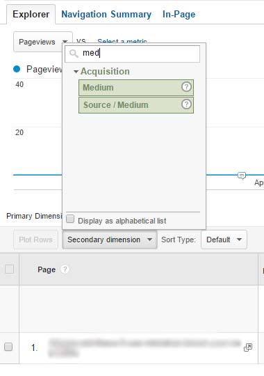
Now, somewhat similar to what we did with before, click the “Secondary dimension” drop-down box, then type in “Medium” until you see that “Source / Medium” option appear—see screenshot:
(click here to open above image screenshot in new window)
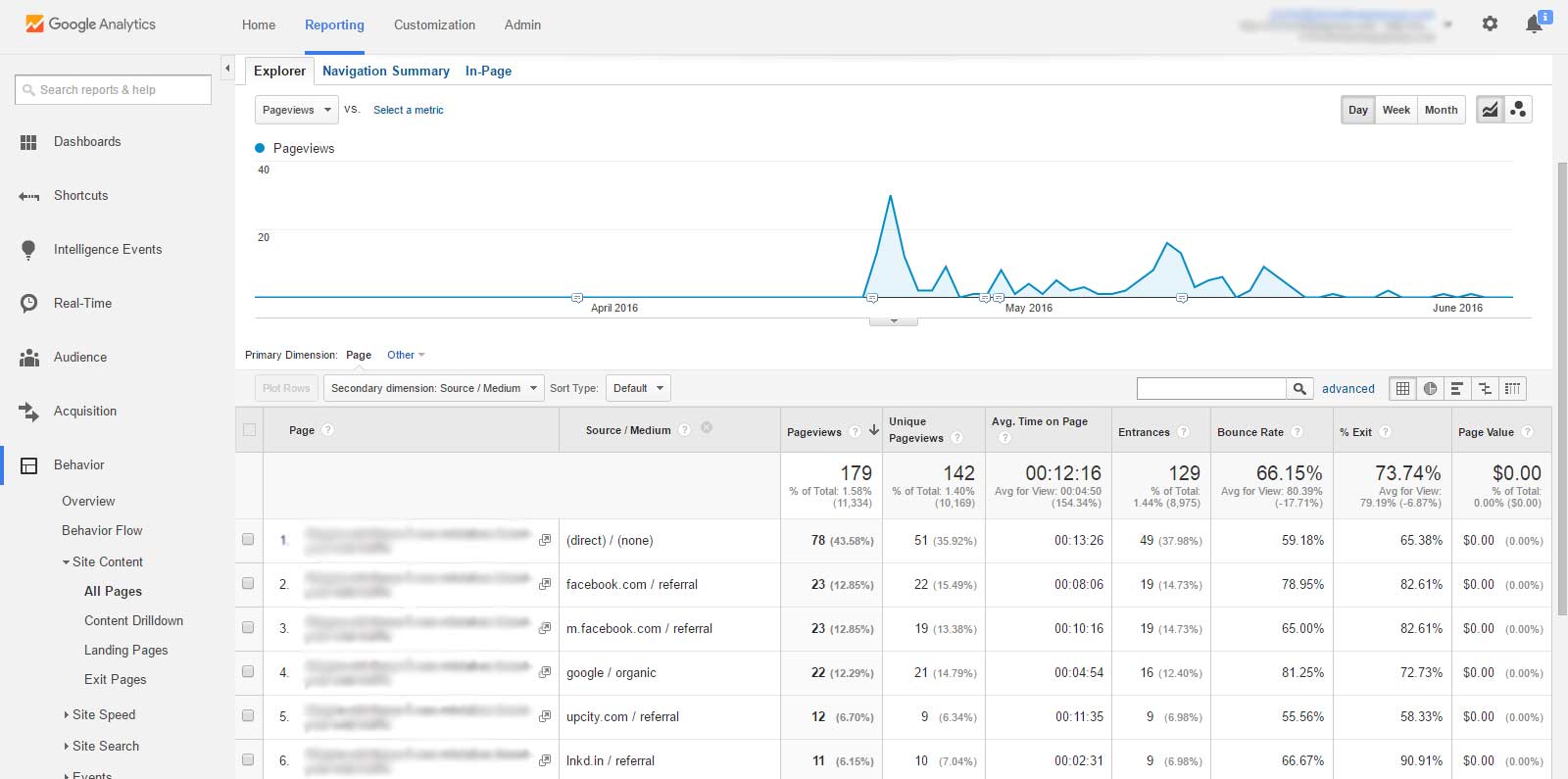
After clicking “Source / Medium,” your screen will list out the top source + medium combinations that drive web traffic to the specific page you’re viewing—see screenshot:
(click here to open above image screenshot in new window)
And if you’d like to, say, plot your organic traffic on the graph versus the total traffic, you can check the box next to the appropriate row and then click “Plot Rows.”
2) Behavior Flow for Understanding/Visualizing User Navigation
Like flow charts?
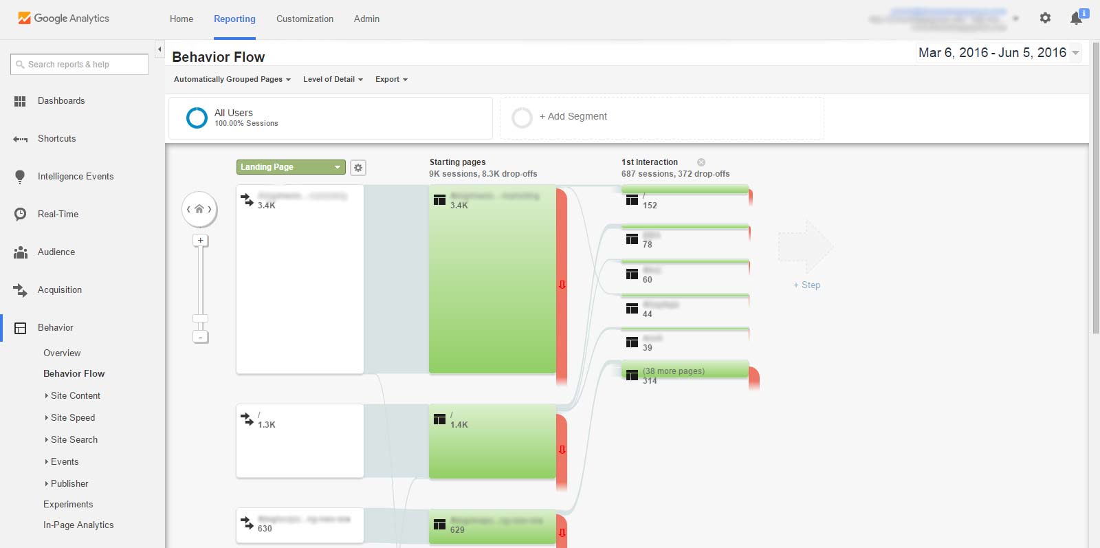
Click “Behavior Flow” underneath “Behavior.”
You should now have a detailed flow chart for all the web traffic within the date period you have selected:
(click here to open above image screenshot in new window)
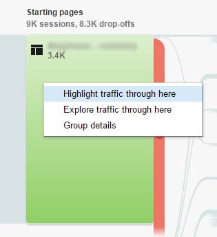
Now, click a page that receives a lot of traffic and then you will be given the options to “Highlight traffic through here” or “Explore traffic through here.”
(click here to open above image screenshot in new window)
Clicking “Highlight traffic through here” will highlight all other pages connected to the entire traffic flow stemming from that webpage. It provides an easier visualization of where traffic clicks through to after landing on that webpage—see screenshot:
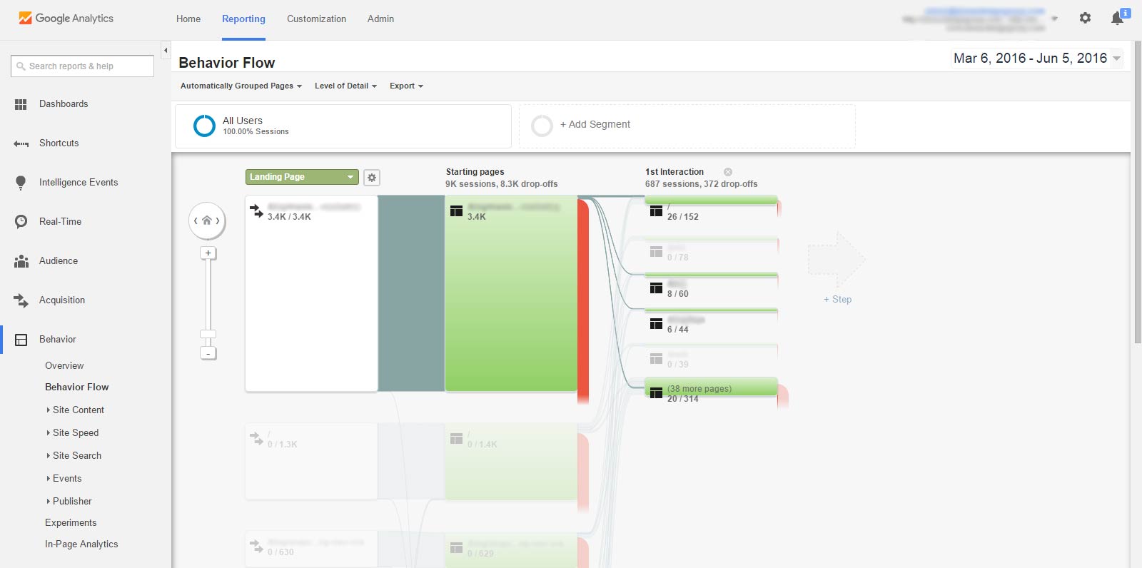
(click here to open above image screenshot in new window)
If you’d like to see which pages flow into the specific webpage in addition to which pages do users click through to from that webpage, click “Explore traffic through here.” See screenshot image:
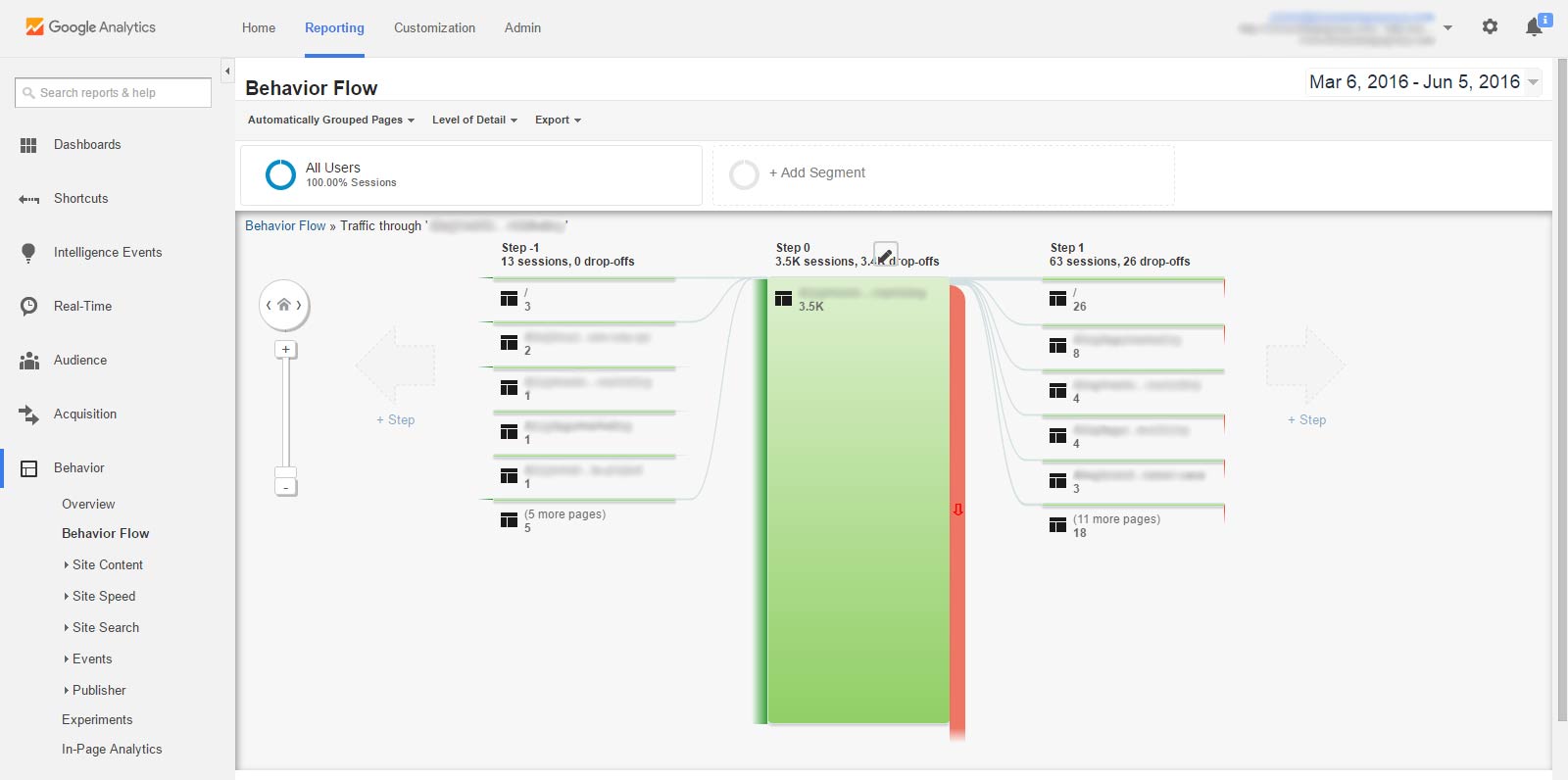
(click here to open above image screenshot in new window)
1) Location-Based Breakdown of Webpage Traffic
Location, for many small businesses, is hugely important.
Perhaps your business offering is location-specific or maybe you are just looking to target users who’d enjoy the nearby convenience.
Either way, your target location(s) for potential customers/clients could be in different countries, states, or cities. If you have separate webpages intended for different location-based audiences, or would just like to see where your webpage viewers are coming from, this report will prove beneficial.
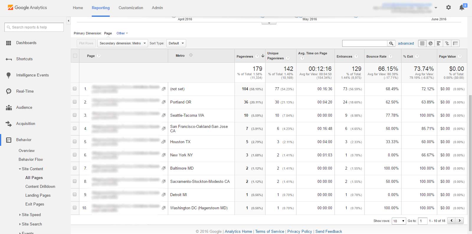
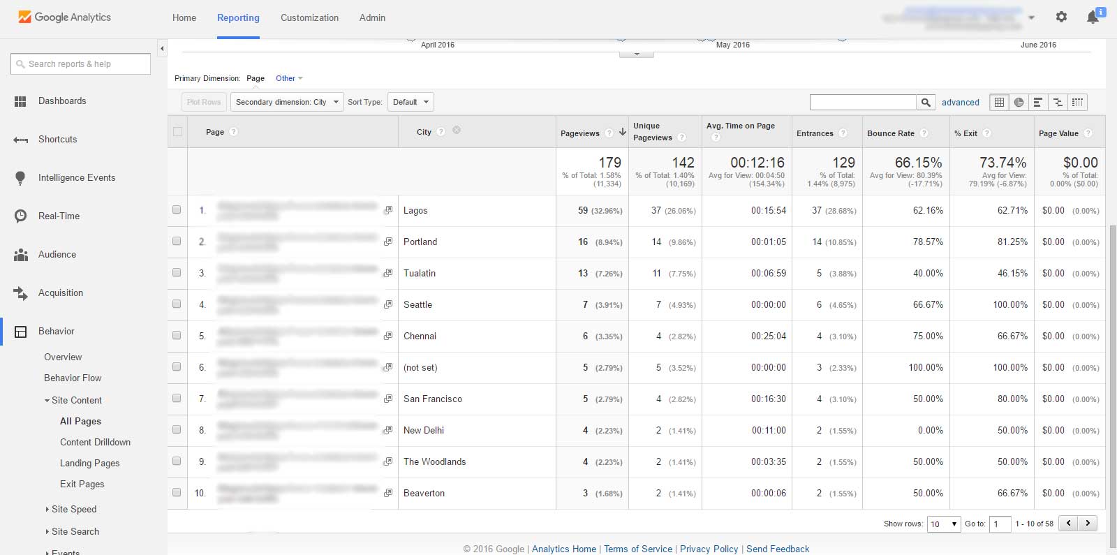
So, after clicking through “Site Content,” then “All Pages,” and then picking a specific webpage of your choice, click the “Secondary Dimension” drop-down box to display the text box. Now, type in and select one of the following options: Country, Region (U.S. States), Metro, or City.
Here’s how those 4 options look in Google Analytics, in respective order:
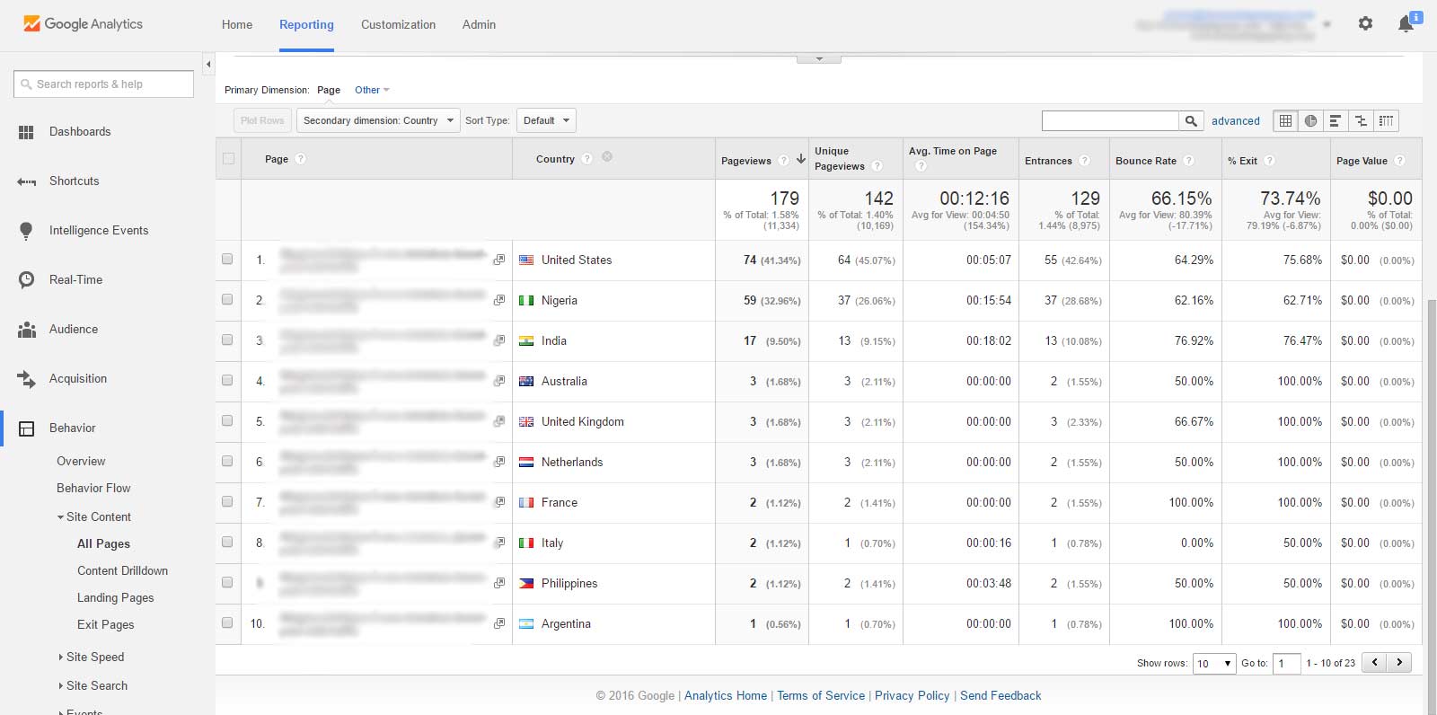
(click here to open above image screenshot in new window)
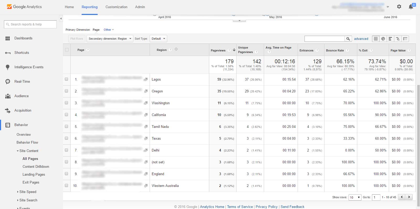
(click here to open above image screenshot in new window)
(click here to open above image screenshot in new window)
(click here to open above image screenshot in new window)
It’s also certainly worth knowing that there are several other demographic options to choose from, aside from location. These include users’ age, gender, user type (new vs. returning), device category, browser, and plenty, plenty more.
Quick Summary to Effective Web Analytics:
- Experiment with your data across different time periods in accordance with changes to your website, execution of marketing campaigns, and the occurrences of relevant events to your business.
- Measure the effectiveness of your website’s different sources of traffic and understand which are the most receptive to your messaging and engaged with your site content.
- Study up on the more advanced tools within Google Analytics, such as creating segments, using the search console, and tracking goals/conversions.
- Ensure your online marketing strategy contains all the digital marketing necessities to maximize your business’ growth and profit, while beating out the competition.
Need a website? We’re Drupal, WordPress, and CMS web experts.
Contact DDG to upgrade your digital strategy!
